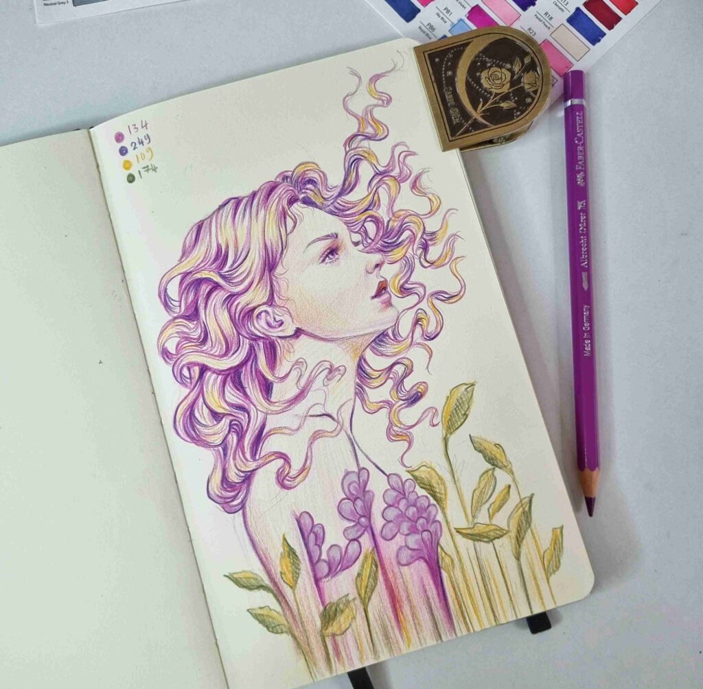
Lately, I’ve been exploring the emotional power of color in my sketchbook — especially how complementary colors can create harmony, contrast, and a little bit of magic.
In this piece, I drew a girl looking upward — her eyes gently lifted toward the sky, filled with a quiet sense of hope. I wanted to express that moment of looking beyond, of believing that something beautiful is coming.
To do that, I worked with two complementary colors: purple and yellow — but not in their purest forms. I played with muted, slightly shifted tones, leaning a little toward lavender, mustard, and earthy hues. This subtle shift adds depth and feeling, showing how color doesn’t need to be loud to speak powerfully.
I used coloured pencils for this piece. I love how this medium lets me balance between softness and precision.
This sketch isn’t just about technique — it’s about emotion, movement, and the quiet courage of hope.
It’s the kind of piece I can imagine as a gentle art print on your wall, or as a beautiful sticker on a journal or laptop — something that reminds you to keep looking up.
Would you like to bring this hopeful girl into your world? Let me know — she may be available in the shop very soon. 💛💜